There is an ongoing project set up in the R Data Science Community known as “Tidy Tuesday.” Each week an interesting dataset is posted with varying degrees of data cleaning required. Members of the R community are then encouraged to clean/explore the data and share interesting visualizations and conclusions on Twitter, etc with the #Rstats hashtag. This has been really helpful for me to apply what I have been learning to real life data sets. Every now and again I will devote a blog post to a “Tidy Tuesday” dataset that I find interesting.
This week’s dataset focuses on clean energy in the form of wind turbines in the US. Details on year of origin, operational characteristics as well as latitude and longitude are provided. Let’s have a look at the distribution of wind turbines across the US states to see who is leading the way in this form of renewable energy.
What States have the most wind turbines?
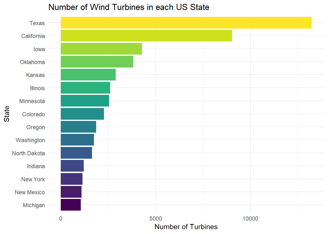
Texas leading the way with over 13,000 wind turbines across the state, and California with the next most at around 9,000. This isn’t exactly surprising to me. All other factors aside, these two are the largest states by total area (other than Alaska), and a collection of wind turbines known as a wind farm is quite massive.
Maps in R
Whenever we have information sorted geographically like this, it is just asking to be plotted on a map, so let’s give that a try. I recently stumbled upon a tutorial regarding plotting shape files in r using ggplot2. This was a great introduction to one of many techniques for working with shapefiles, colour-coding information by region, and adding informative labels to plots. The map_data function is used below to get polygon coordinates for the US states and plot a density map of turbines across the country.
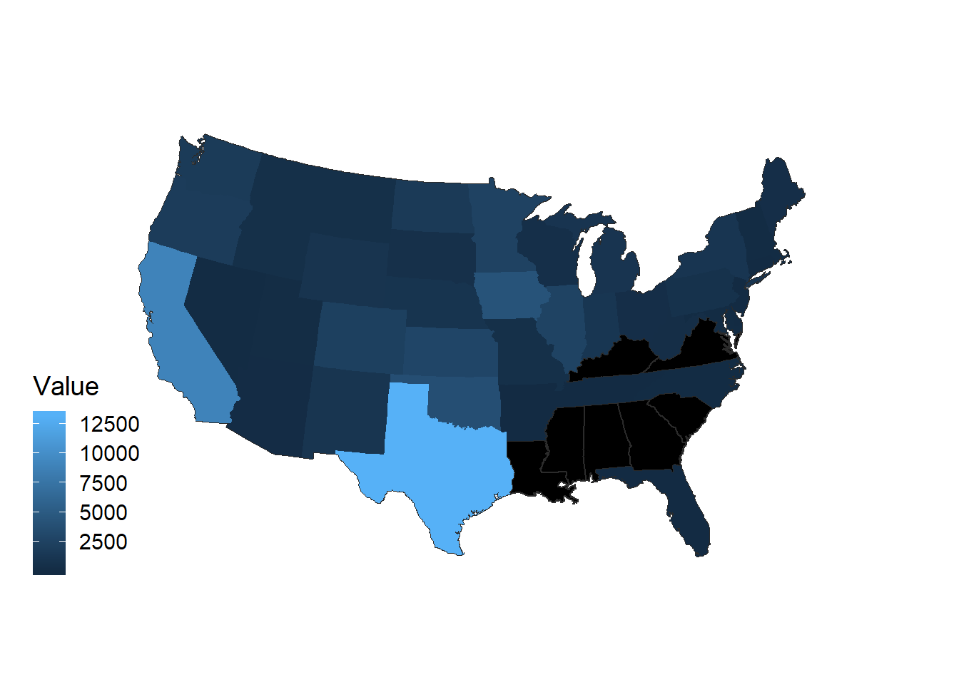
This plot displays much the same information as the bar chart above, but this arrangement allows us to start to see geographical relationships. For example, observe the relative absense of wind turbines in the southeast states such as Mississippi, Alabama, Georgia.
in addition to state, we have precise information on latitude and longitude which we have not utilized yet, so we can add one more level of detail using a density plot in r.
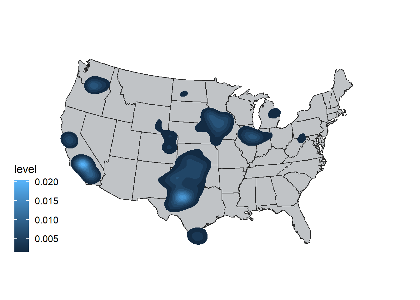
I like this plot becuase it really highlights the areas that we care about and gives us a sense of where the wind turbines are located within each state.
How has the distribution of Wind Turbines across the United States changed over time?
Which was the first state to adopt wind turbines as an energy source? How has the spread of wind farms changed across the country over time? These are both questions that we can answer because we have the date that each wind farm project was established included in this dataset. Instead of putting this sort of information on a line chart and coloring by state or region, we can utilize the wonderful gganimate package to visualize the growth of these farms through time. the transition_reveal function iterates over the variable containing year of establishment and adds layers to the plot at each frame.
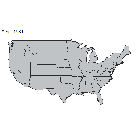
As we can see, California was clearly the earliest adopter of this technology, followed by a large influx through the middle region of the country in recent years. I attempted to repeat this technology for wind farms across Canada, as I am from Vancouver Island myself, but struggled to find a shape file for the provinces that was at a resolution my computer could handle (so many intricate coastlines!) If anyone has any suggestions for this, please let me know! Thanks for reading.
Here’s a parting shot of my dog Olive inadvertently testing potential wind farm locations on Vancouver Island 😂